2
Learning Objectives
- Understand the primary ways to measure population distribution and structure
- Explain the Demographic Transition Model
- Discuss the effects of a changing population
- Describe why people migrate
- Identify the changing characteristics of migrants to the United States
In 1800 CE, the world’s population stood at 1 billion people. Think about that a moment: it took the entirety of human history up until the year 1804 to reach its first billion people. The next billion came just 100 years later in the late 1920s. Today, the world’s population stands at close to 8 billion people. But where do many of those people live? Where is the world’s population growing the fastest? Why do some people migrate to other areas? And what factors influence population distribution and dynamics? This chapter examines both population and migration.
2.1 Population Distribution
If you could live anywhere, where would you want to live? What type of climate and physical environment do you enjoy? I’m partial to a tropical beach, but you might be more inclined to choose a picturesque mountain landscape. Why do people live where they do? Well, just think of the characteristics of your ideal place. Most people tend to avoid living anywhere where there are environmental extremes, areas that are extremely wet, dry, cold, or high. Thus close to the poles, we see almost no human habitation. Similarly, very few live in arid deserts. Rather, most people tend to live in relatively temperate areas near water. In fact, only around 10% of people in the entire world live over 10km (or just over 6 miles) from a source of fresh surface water. Why might this be the case? Today, in more developed countries, you can generally turn on the faucet and easily access fresh water. But how did our ancestors care for crops and access drinking water? Not having an easily accessible source of fresh water would have made an area inhospitable. And while we might have more flexibility with where we choose to live today, the historical patterns of where towns and cities were located has influenced the distribution of our global population even today.
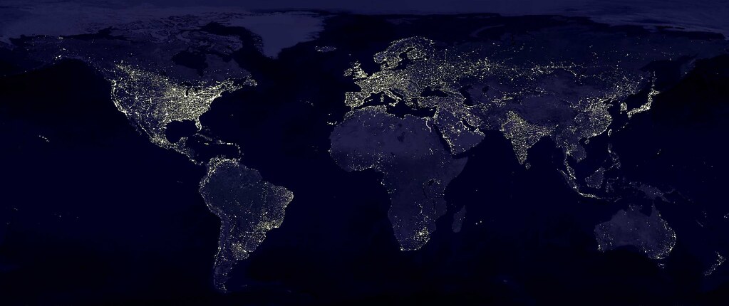
If we look at the world at night (see Figure 2.1), we can see where the major clusters of population are located in the world today. Most of our population today is clustered in one of four areas: Europe, East Asia, South Asia, and Southeast Asia (see Figure 2.2). Around two-thirds of people in the world today live in one of these areas.
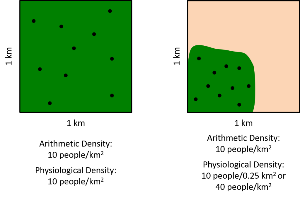
So how do we measure population? We could just count the number of people in a particular country, but it’s helpful not just to know the number of people, but to analyze how those people are distributed within an area. If we examine population density, we can better understand the spatial pattern of people living in a particular area. There are three primary measures of population density: arithmetic, physiological, and agricultural. Arithmetic density is simply the number of people per unit area. It’s the easiest to calculate, since you just need to know the number of people and the size of the area of land. If you have a 10 by 10 kilometer square and 100 people in that area, the arithmetic density would be 100 people per 100km2.
While arithmetic density is simple to calculate, its limitation is that it assumes that all land is the same. People can’t live in the middle of a desert (for very long, anyway). So, arithmetic density only tells us part of the story. It might not really tell us how tightly packed people are really living in an area. Take Egypt, for example. Egypt is a fairly large country, and its arithmetic density is 99 people per square kilometer (as of 2020). The United States, by comparison, has an arithmetic density of 33 people per square kilometer, so you might conclude – just from looking at the arithmetic density – that Egypt is marginally more dense than the United States. The problem is that very little of Egypt consists of arable land. (Look back at the world at night picture for proof. Notice that the only lights in Egypt are along the Nile?) Most of Egypt is desert and the only arable region is right along the Nile river. So how can we take this difference into account?
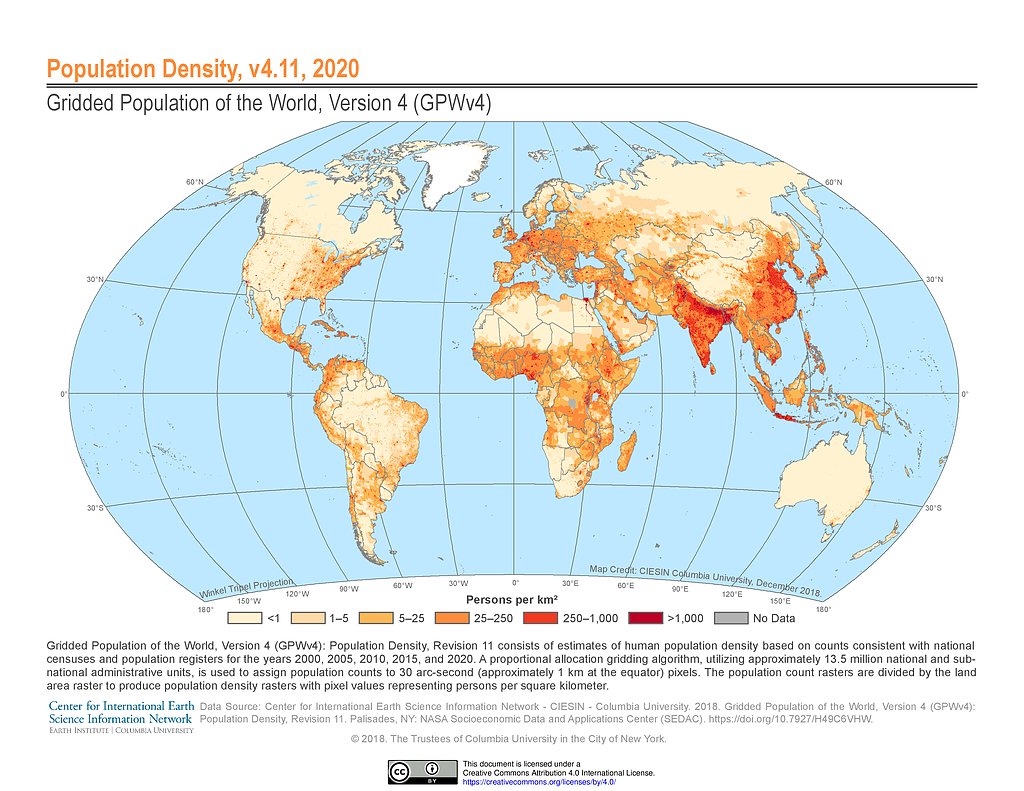
Physiological density specifically examines the density of people relative to the amount of arable land, meaning land that is available for agriculture. It’s quite a bit harder to calculate (how challenging would it be to determine how much land in a country is available for farming?) but it paints a much more accurate picture of how densely people are actually living (see Figure 2.3). When we compare the physiological density of the United States and Egypt, we see that the United States has a physiological density of 199 people per square kilometer (using a 2016 estimate of arable land area and the population as of 2020), so not all of our land is available for agriculture but a fairly high percentage of it compared to other countries. Egypt’s physiological density, however, is an astounding 3,535 and all but 5% of Egypt’s population lives along the Nile River. Singapore has one of the highest population densities of any country with an arithmetic density of over 8,000 people per square kilometer and a physiological density of over 1 million people per square kilometer, with less than 0.8% of their land available for farming!
Another measurement of density is agricultural density, which looks at the ratio of farmers to the amount of arable land. Where do you get most of your food from? Do you grow your own tomatoes, harvest your own corn, and get fresh eggs out of the chicken coop each morning? Perhaps you do, but more than likely, you get your food at a supermarket, which means someone else, a farmer, is harvesting that food for you. Agricultural density can help us understand the economic differences between two countries. Countries might have similar measures of arithmetic and physiological density, but yet have vastly different economic situations. In the United States, we have about 2 farmers for every square kilometer of arable land. Just two people farming an entire square kilometer of land. India, by comparison, has around 19 farmers per square kilometer of arable land. Agricultural density can be challenging to calculate because you need to find not only the number of farmers living in a country, which is not always easily available, as well as the amount of arable land, which again can be difficult to uncover. Still, in general you can assume that a country with a high agricultural density, meaning a high number of farmers per area, is more likely to be less developed, while a country with a low agricultural density (fewer farmers per area) likely has more industrial farming practices and is more highly developed. Additionally, having a lower percentage of arable land means that countries with higher populations will put more pressure on that land to be productive.
2.2 Population Structure and Change
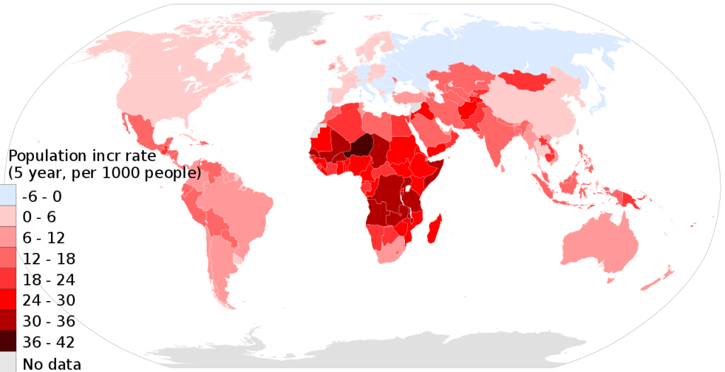
Human geography doesn’t just tell a story of where we’ve been or where we are now, but where we’re going. How will our population change in the future, and what effects will those changes have on our larger society and world? Geographers use three primary indicators to measure population change: the natural increase rate, the crude birth rate, and the crude death rate. The natural increase rate (or NIR) is the percentage by which a population grows in a year. It varies from Bulgaria, where the NIR is actually negative 0.7% (according to the Population Reference Bureau, which has robust population data for each country), meaning its population is declining at around 0.7 percent each year, to Angola where the NIR is 3.5% and the population has grown from around 23 million in 2010 to over 32.5 million in 2020. The current global rate of natural increase is 1.1%, which might not sound like a lot, but 1.1% of 7.8 billion people is an additional 85.8 million people each year! The peak global NIR was in 1963 at 2.2%. At the current global rate, our population is projected to be over 9.8 billion by mid-2050.
The crude birth rate, or CBR, refers to the total number of live births in a year generally for every 1,000 people. Thus a CBR of 20 typically means that 20 babies are born for every 1,000 people in a society. The crude death rate, or CDR, is the total number of deaths in a year for every 1,000 people. The natural increase rate is calculated simply by subtracting the CDR from the CBR, essentially subtracting the rate of deaths from the rate of births. Put simply, where more people are born in a country than die in that country each year, the population would increase and you’d have a positive natural increase rate. Where the reverse is true, and relatively few people are being born compared to the number of people who die in a country, you’d find a negative rate of natural increase.
Let’s practice: India currently has a CBR of 20 births per 1,000 people and a CDR of 6 deaths per 1,000 people. So what is its NIR? Again, the NIR is calculated by subtracting the CDR from the CBR, so: 20 per 1,000 (CBR) minus 6 per 1,000 (CDR) equals 14 per 1,000. Keep in mind that the CBR and CDR is per 1,000, so to calculate the NIR as a percentage, you would simply divide 14 by 1,000, which would give you an NIR of 1.4%. What about Poland, where the CBR is 10 and CDR is 11? 10 – 11 = -1. Negative 1 divided by 1,000 is -0.001, or -0.1%.
Where we find the highest rates of natural increase are primarily in developing countries, whereas in parts of Eastern Europe, Russia, China, and Japan, the population is actually decreasing (see Figure 2.4). Note that the rate of natural increase does not include migration, so some countries might have a decline in population were it not for an influx of immigrants.
Another key measure of a country’s population is its total fertility rate, or TFR, which is the average number of children a woman will have throughout her childbearing years (defined as ages 15-49). The current global fertility rate is 2.3, meaning that most women on average will have 2.3 children. The TFR roughly equates to the average family size within a country. In the United States, our TFR is 1.7, so most families these days have one or two children. Do some families have no children, and other have far more? Of course, but on average families are generally fairly small. In Japan, the TFR is only 1.3, with most families only having one child, while in Nigeria, family sizes are generally much larger with a TFR of 5.3. How many children are needed to replace the current generation? If a couple has two children, they have essentially replaced themselves. If they have more than two children, their family tree will look much more like an actual tree, growing larger with each generation. This idea is known as the replacement rate, which is estimated at 2.1 children per woman and accounts for the fact that not all children will reach adulthood. If a country’s TFR is greater than 2.1, each generation will be able to replace itself. A TFR less than 2.1 means that a country’s population will decline. If you note that the global TFR is only slightly above the replacement rate, this means that the global population is relatively stable, increasing only gradually. However, as we’ve mentioned, the TFR varies greatly by country.
Sadly not all children reach adulthood, and infancy for every species including humans is fraught with danger. The infant mortality rate, or IMR, measures the annual number of deaths of infants under 1 year of age, compared with total live births. It is usually expressed as number of deaths among infants per 1,000 births. The IMR is affected by a variety of factors. Certainly it reflects a country’s healthcare system. Countries with lower IMRs generally provide healthcare for all its citizens and have high levels of maternal nutrition and care. IMR can vary within societies, however, particularly among ethnic and racial groups and by region or state. In the United States, for example, the IMR in 2017 was 5.8 deaths per 1,000 live births. (The United States ranks quite low overall in terms of IMR, according to the CIA’s World Factbook, having a higher IMR than 55 other countries. Japan, by comparison, has an IMR of 2 deaths per 1,000 live births.) However, within the United States, this number varies significantly. In New Hampshire in 2017, for example, the IMR was 4.2. In Mississippi, it was 8.6 that same year. And among black babies born in Mississippi, the IMR was 11.6.
At the other end of the lifespan, broader mortality rates and life expectancies also vary by country. Life expectancy refers to the average number of years a newborn infant can expect to live. It is a highly complex calculation that looks at likelihood to survive at every age. The highest life expectancies are found in more developed countries, and again reflect societal issues such as access to healthcare. Japan consistently has one of the highest life expectancies at around 85 years. The life expectancy in Chad in 2017, by comparison, was only 50 years. In the United States, the life expectancy is around 80 years. Life expectancy has changed significantly over the course of human history. For Neanderthals, a high likelihood of accidents and a scarcity of food contributed to a life expectancy of just 30 years. During the late Middle Ages, plagues and famines hampered life expectancy increases contributing to an average lifespan of around 38 years. In the 1900s, improvements in healthcare and sanitation led to sustained increases in the life expectancy to around 70 years.
All of these statistics, births rates, death rates, life expectancy and impact how a population will grow and change. One helpful way of understanding how fast a country’s population is increasing is known as doubling time. Doubling time refers to the amount of time a population takes to double in size and the formula can actually be applied to a wide range of phenomena from interest rates to the spread of illness. It can be roughly calculated by dividing 70 by the percentage growth rate. Thus, a country with a population growth rate of 1.1% will double in 63 years. A country with a growth rate of just 0.5% will double in 140 years.
These changes in population over time can be graphically presented using a population pyramid. Population pyramids display the percentage of a country’s population for different age and gender groups. (Sometimes the figure lists actual population numbers rather than percentages.) The shape of population pyramids change as the CBR changes. Furthermore, every 5 years, each age cohort moves up, further changing the shape. Despite being called population pyramids, not all population pyramids actually have a pyramidal shape. Countries whose populations are growing very rapidly will have a population pyramid with a very wide base relative to its top, whereas countries with a decreasing population pyramid might look like an upside-down triangle. Let’s look at some examples.
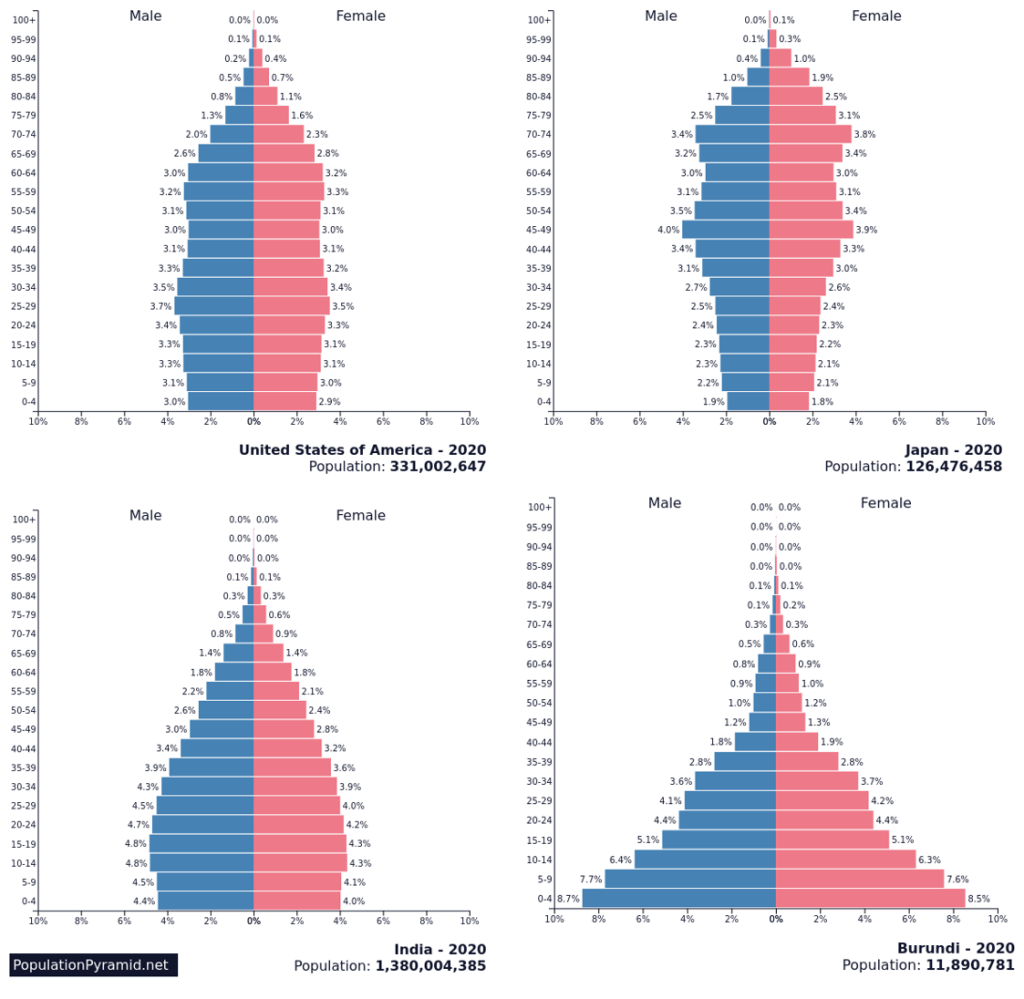
Figure 2.5 displays several population pyramids and the shapes are all quite different. Which population is increasing at the fastest rate? Look at the shape of Burundi’s pyramid – notice that the bottom of the pyramid is very wide compared to its top and that the bottom few cohorts (ages 0-4, 5-9, and 10-14) are each quite larger than the next. As these groups age and a new cohort is added on the bottom of the pyramid, what will it look like? It will likely continue to be wider and wider, and this indicates a growing population. What about Japan’s population? Is it increasing, decreasing, or staying the same? Japan’s pyramid shows a slight narrowing at its base and this indicates that its population is declining. Population pyramids can also tell us what was happening in a country’s population years ago. Imagine covering up (or actually cover it up if you have a piece of paper handy) the bottom of India’s population pyramid, and only examining its top, ages 40 and up. What would you have said about how its population was changing 40 years ago? It was increasing quite rapidly. Then what happened? It looks like its population began increasingly more slowly and is now relatively stable.
Finally, keep in mind that a population pyramid reveals both the age structure of a population and its structure by gender. How might this be useful? Look at the percentage differences in gender in India among young children (ages 0 to 4). 4.4% of India’s population consists of males age 0-4 and only 4.0% of its population the same age are female. In a given society, these numbers should be roughly even, though the youngest cohort will naturally be slightly skewed male since more boys are born than girls but boys are also more likely to die in childhood. Thus, these numbers should even out until the top cohorts, where they will tend to be skewed female since women generally have higher life expectancies than men. Where the gender ratios significantly differ, there might have been male deaths due to war (as is apparent in the historical population pyramids of countries like Germany) or, particularly when these differences are very apparent in younger cohorts, there might be significant gender discrimination in a society and preference for male children that can lead to selective abortions or infanticide. Population pyramids can convey a great deal of information about a population’s current structure, its historical patterns, and likely changes in the future.
2.3 The Demographic Transition Model
As you might have noticed, often a country’s birth rate, death rate, and population growth reflects its broader levels of development. Countries that are highly industrial and urbanized tend to have relatively low birth rates and low death rates, while countries that are more rural and agricultural tend to have larger families and relatively higher death rates. This change in the birth rate, death rate, and population growth over time can be charted, and we tend to find that most countries follow the same essential pattern. This chart is known as the Demographic Transition Model, or DTM, and it is a critically important model of how a country’s population structure and growth changes over time (see Figure 2.6).
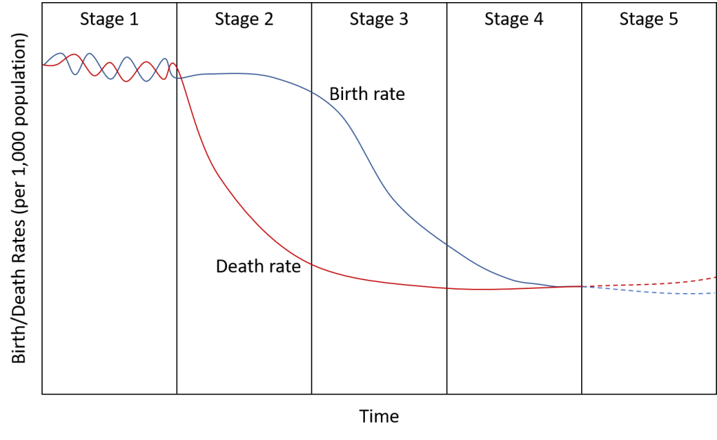
The Demographic Transition Model has five different stages, and though each country’s DTM is unique, we find that the general model fits in most cases. Let’s walk through the stages. Stage 1 of the DTM is characterized by a very high birth rate and a very high death rate. So what’s happening to a country’s overall population in this stage? Is it growing, decreasing, or staying the same? Think back to the natural increase rate: a country’s population increases when the birth rate is higher than the death rate. In this case, as you can see in the figure, they’re about the same, so the population will be relatively stable. Stage 1 would have been typical of feudal Europe, with very large families but also widespread diseases and high mortality. No country remains in stage 1 today.
In stage 2, notice that the birth rate remains high (with larger families still the cultural norm), but the death rate begins to rapidly decline. The plummeting death rate could be something as simple as understanding the importance of hand-washing or providing basic sanitation systems, or it could come as a result of a vaccine. Increases in the food supply could similarly reduce mortality and increase life expectancy, and these improvements in food security usually come about as a result of innovations in farming. Improvements in healthcare systems and education similarly contribute to a decrease in the death rate. Note that birth rates remain high in this stage, however. Why might this be? Stage 2 countries are primarily rural and agricultural. How many children did your great-grandparents or great-great-grandparents have? Are large families typical in more agricultural communities? In rural, less developed areas, having a large family is not only a cultural norm but is also helpful. More children mean more help around the farm. More developed countries went through stage 2 around 200 years ago as a result of the Industrial Revolution. Many less developed countries passed through this stage 50 years ago because of the transfers of medical technology, such as vaccines. Some countries remain in stage 2 today, including many countries in Sub-Saharan Africa, Afghanistan, and Yemen. In stage 2 leading into stage 3, we typically see the most rapid increases in a country’s population.
In stage 3, a country begins to become more industrialized. Birth rates fall due to a variety of factors. Access to contraception becomes more widespread. Education, particularly for women, improves, and with it comes an increase in the status of women and an increase in the number of women in the workforce. As a country urbanizes and jobs shift from agriculture, there is a reduction in the value of children’s work. There is also an increase in the parental investment in the education of children. In this stage, people begin to choose to have fewer children, and the cultural values of having a large family begin to shift. Much of Latin America (Mexico, Chile, etc.) and Northern Africa remain in this stage. More developed countries went through this stage around 100 years ago.
During stage 4, the death rate remains low and the birth rate continues to lower, approaching the death rate. Stage 4 represents a highly urbanized, highly industrialized society. Here, families might live in crowded cities where having a large family might be challenging, or both parents might be working, with childcare costs similarly making a large family cost prohibitive. Cultural values have shifted and having small families has become the norm. If you’re not already a parent, how many children would you like to have? In the United States, which is in stage 4, the common answer is two children, with some families having more and some less. If you’d ideally like to have one or two children, or no children (or if you’d prefer a larger family, imagine why people would choose to only have a small number of children), what factors influenced your decision? These factors are collectively shared within a society and contribute to larger fluctuations in the birth rate.
Years ago, some proposed that a stage 5 should be added to the DTM, and it certainly seems like a stage 5 is apparent when you examine the population changes in countries around the world. In this stage, there are a variety of changes that may occur. In some cases, as in Japan, the death rate remains low and life expectancy is quite high, but the birth rate has fallen below the replacement rate and below the death rate, and thus the country’s population will decline. In other cases, as in Russia, the birth rate might actually increase a bit, but the death rate could increase. As a country builds wealth and economically advances, nutritional choices can become more difficult and there can be a rise in obesity-related illnesses or alcoholism. In addition, increases in urbanization and connectivity can contribute to a reemergence of infectious diseases, which could similarly increase the death rate. In either case, a country’s population would decrease when its birth rate is below the death rate.
Closely related to the DTM is the Epidemiological Transition Model, sometimes simply referred to as epidemiological transition. This model explores the changes in disease patterns and causes of death corresponding with various stages of the demographic transition model. In stage 1, what were the leading causes of death? Malnutrition, infectious disease, and famine were all common, and thus this stage is known as “The Age of Pestilence and Famine” (certainly not an upbeat term.) stage 2 is referred to as “The Age of Receding Pandemics.” Here, as we’ve explored, we see declines in the mortality rate and improved sanitation and healthcare, including the widespread use of vaccines. Stage 3 is “The Age of Degenerative and Man-Made Diseases.” In this stage, we see that as societies improve, there might be malnutrition coming as the result of getting the wrong types of nutrients. Obesity-related illnesses emerge. As people live longer, and are exposed to more environmental contaminants, we also see a rise in illnesses like cancer as well as age-related degenerative diseases. In stage 4, characterized as “Delayed Degenerative Diseases,” improvements in medicine have often been able to delay age-related illnesses and improve mortality rates for various cancers increasing overall life expectancy. Finally, just as we are seeing the emergence of a stage 5 of the DTM, some have hypothesized that there is a stage 5 of the epidemiological transition model. In this stage, we might see the reemergence of infectious diseases or widespread pandemics due to an increase in global connectivity. The COVID-19 coronavirus pandemic certainly speaks to the challenges of our interconnected modern society. Furthermore, as existing diseases and illnesses are battled, there is sometimes a rise in strains that are resistant to our current antibiotics or treatments, and thus we may see diseases reemerge if current innovations and technology do not continue to improve.
2.4 Impacts of Population Change
As a country develops and its population shifts and changes, these changes can have a significant impact on a country’s well-being. Why might that be? Imagine a country’s population is increasing very rapidly. What challenges might it face? It might have to build more schools and hospitals, ensure that it is growing the economy to provide jobs for a growing workforce. It might have a higher resource use, or perhaps use resources in an unsustainable way to support a rapid increase in population. What about a country whose population is decreasing? A country with a larger top section of its population pyramid would have a rapidly aging population, and relatively fewer workers to fund social programs. This relationship is called the dependency ratio. The dependency ratio is the number of people who are too young or too old to work compared to the number of people in their productive years. Why would this ratio matter? Again, a large percentage of children requires a lot of schools, hospitals, and day-care centers. A large percentage of older people also requires increased social services like medicare and nursing homes. More than one-quarter of all government expenditures in the US, Canada, Japan, and much of Europe go to Social Security programs, health care, and other services for the elderly. The dependency ratio is reflected in a country’s population pyramid, with a population pyramid that has a very wide base and/or a wide top relative to the middle sections indicating a high ratio of non-workers to workers within a society and thus a high dependency ratio.
More broadly, how will changes in our population and development impact our use of the earth’s resources? When will our population be too great for Earth to handle? Will we have enough food to support human life? Thomas Malthus was an English economist living in the late 1700s and early 1800s who considered these essential questions. And he had a pretty grim answer. He published a paper in 1798 that claimed that our population was growing much more rapidly than our supply of food. Essentially, he said our population was increasing geometrically (also called exponential growth) whereas food supply only increased arithmetically (See Figure 2.7).

At the point where population outstripped food production would be a widespread famine, or a Malthusian catastrophe noted in the model. This obviously is not ideal, so what could alleviate this? Well, Malthus advocated either “moral restraint,” calling for people (particularly women) to simply have less sex and thus fewer children. Alternatively, things like war, famine, or disease would wipe out large numbers of people, again reducing the population and the likelihood of a Malthusian catastrophe. In this way, Malthus saw large-scale population decreases not as evils to be avoided per se, but rather, as natural, “positive checks” as he called them, of our population that would lower the population relative to our food production.
In actuality, though, our population did not increase as drastically as Malthus predicted. And our food production has actually increased substantially relative to our population. So in a way, Malthus’ basic premises were incorrect. Still, Neo-Malthusians, that is, supporters of Malthus, argue that the world uses a variety of resources, not just food. Thus, while our overall food supply has outpaced population growth, we’re stripping the earth of other resources and are deteriorating the environment at an unsustainable rate. Furthermore, Malthus failed to anticipate the rapid population growth of relatively poor countries – so our population is growing in the very areas least equipped to handle it.
On the other hand, Malthus’ critics say that larger populations could stimulate economic growth and help develop new technologies. Statistically, a large population would have more geniuses, and ideally one of them would solve all our problems. A fundamental problem with the Malthus model is that today, we have plenty of food for everyone. (So much so that we have problems with obesity in more developed countries, as we’ve explored, because we have way too much food.) But this food is allocated unevenly, with some countries having far too much, and others having far too little. It’s not an easy problem to fix. Poverty and hunger are effects of injustice; if resources were shared equally, we could alleviate global hunger.
So what’s the reality? Well, as the result of modern technologies such as genetically modified crops, we now have record-breaking crop yields year after year. And global population did not reach the level Malthus predicted (and furthermore, widespread contraceptive use has been able to address his concern about having fewer children.) Should we just dismiss Malthus, then? If we look broadly at the global distribution of wealth, we see severe inequalities. Global wealth has not kept pace with global population increase, or at least has been highly concentrated. The countries whose populations are growing the fastest today are some of the poorest. Why? Think back to the demographic transition model. So while many of the details of Malthus’ theory have been proven wrong, the broader questions of what is sustainable and how do we use resources relative to our population are critically important.
Malthus’ core theory hinged on the idea of overpopulation, and this occurs when a population exceeds the carrying capacity of its habitat. So often, “overpopulation,” the sheer number of people, is the only factor considered. What’s really the problem, however, according to many geographers, is overconsumption. Overconsumption takes per capita consumption into account. In other words, how many resources does each person in a society use on average and is this resource use sustainable?
So how does a country change its population? If a population is declining and its citizens are rapidly aging, how do you increase the fertility rate? Government incentives, such as tax breaks, to have more children are common in these cases. A country might promote having larger families as a point of national pride. Conversely, how would you decrease the fertility rate in a population that is rapidly increasing? Commonly, governments promote widespread contraceptive use or even sterilization programs. These solutions are relatively inexpensive, though they may come at odds with religious or social beliefs. A more long-term solution would be improve education and employment for women. When women are more highly educated and represent a larger proportion of the workforce, their position in society changes. They are empowered to make their own reproductive decisions. They may delay marrying or starting a family as a result of advancing their education and career. This would not only decrease the birth rate but would also contribute to a country’s economic output. However, this solution is more complicated and has less immediate effects.
A more drastic solution in cases of rapid population growth would be to try and artificially skip a stage of the DTM, perhaps through a government mandate. In the case of China, for example, its population stood at about 1 billion in the 1970s and there was fear about rapid population growth. In 1979, the Chinese government implemented the one-child policy, essentially limiting most Chinese families to one child. There were widespread allegations of forced abortions and forced sterilizations as a result of this policy, and a cultural preference for male children led to selected abortions or female infanticide and a significant gender imbalance. In some provinces, the ratio of men to women is 125 to 100. Consider what effects this has down the road for marriage, and particularly the marriage prospects for poor men in China.
In 2016, a two-child policy replaced the one-child policy in China, allowing all families to have two children (though most families cannot have more than two). Why did the policy change? Remember the replacement rate? If the fertility rate is below 2.1, a population will decline. If the government mandates a very low fertility rate, that country’s population will decline rapidly. And what were the issues related to a declining population we discussed? An aging population puts more demands on a society to provide for its care, and a shrinking workforce will result in declining economic output as a country has fewer and fewer workers. Thus, the policy was changed to address these long-term concerns. However, some are critical that the one-child policy ever needed to be implemented to begin with. While the Chinese government has claimed that its policy was a huge success, looking at China’s demographic transition model, its birth rate had already started to decline prior to 1979, and thus some argue that simply waiting, perhaps while improving job prospects and education for women and promoting smaller families, would have similarly avoided a catastrophic population increase without such a controversial government response and an economic slowdown.
2.5 Migration
Populations themselves grow and shift and change, but the people within these populations also shift and move over time. Migration refers to a permanent move to a new location. Emigration refers to migration from a location while immigration concerns migration to a location. Emigration and immigration are simply the reverse of each other. A person could emigrate from Poland and immigrate to the United States, as was the case for my grandfather when he was a teenager. The number of immigrants (people coming) minus the number of emigrants (people leaving) is the net migration, and a country can have net in-migration (more people coming) or net out-migration (more people leaving.)
Have you always lived in your current city or town? If not, why did you move there? Perhaps your family moved for work, or perhaps you moved there temporarily to attend school. Perhaps your family immigrated when you were young. Where do you hope to ultimately live? People move for a variety of reasons and both push and pull factors are involved in the decision. Push factors are those factors that push or compel people to leave their current location. Pull factors, on the other hand, are reasons why another location would be attractive. Economic push and pull factors are quite common. People are pushed out of one area by a lack of jobs and pulled into another because a company is hiring. Often, we find chain migration, which occurs much like links in a chain with migrants immigrating to a particular city where they know relatives have successfully settled, then perhaps to another city where they know friends, and perhaps still to another city. Migrants are likely to travel where they have a family connection to their home country. Why is this the case? Imagine how challenging it would be to move to a new country without speaking the language and without a job. Chain migration provides stability and the chance to create roots in a new country.
As people migrate, sometimes they encounter what are called intervening opportunities, opportunities that arise between one’s home and selected destination. For example, someone might intend to migrate from Guatemala to the United States, but could find work in Mexico along the border and end up settling there permanently instead. Intervening obstacles are the opposite in that they hinder the possibility of migration. Historically, most obstacles to long distance migration were environmental. Migrants from Europe to the United States, for example, had to cross a vast ocean. Today, many migrants face cultural obstacles, often the inability to speak the local language or prejudicial views toward immigrants.
Note that migration is not the same thing as mobility. Mobility concerns your general movement, which can be very restricted depending on where you live in the world. Furthermore, migration is not always voluntary. Forced migration refers to the involuntary movement of people from one place to another. Africans sold as slaves and transported to the Americas could be considered forced migrants. Forced migration does not necessarily mean that a person was physically removed from their home, however. People might be forced or choose to leave their home country in order to flee war, persecution, or other issues and are unable to return home safely. These migrants are known as refugees. As of 2020, there were 26 million refugees worldwide, according to the Office of the United Nations High Commissioner for Refugees, the highest level ever seen in human history. More broadly, almost 80 million people are considered to be forcibly displaced, including refugees and those seeking asylum, but also those who are internally displaced within a country.
2.6 Characteristics of Migrants
When we consider where people typically migrate to, we find that geography is important: most migrants relocate a short distance and remain within the same country. Think about your own migration story. Where have you moved to and from within your life? Where are you likely to migrate in the future? You may have moved to a different state or region of your home country, but international moves are generally less common. Internal migration refers to a permanent move within the same country. Internal migration can either be interregional, movement from one region to another, or intraregional, within one region. International migration refers to movement from one country to another, and again here geography is important, with most migrants traveling to countries that are relatively close by.
Where people are moving to and from actually relates to the demographic transition model. It’s been theorized that people in stage 1 are unlikely to migrate, but have a high degree of mobility related to searching for food. In stage 2, people will typically migrate to countries in stages 3 and 4 because they offer greater economic opportunity. When we look at countries in stages 3 and 4, we mostly find internal migration, since people are often moving from rural areas to the cities, and then from the cities to the surrounding suburbs.
Considering the characteristics of migrants themselves, a century ago most migrants were typically male because they were migrating in search of work and men were simply more likely to be employed than women. Today, however, those dynamics have changed. Now, over half of all migrants are female. Children also make up a large number of international migrants. Considering Mexico, as well as other parts of Central America, many children are joining their parents as they migrate, and some make the journey on their own, leading to a recent rise in unaccompanied child migrants to the United States. We’ve seen large numbers of child migrants in other regions as well, particularly in areas where migrants are fleeing dangerous situations at home. The voyage itself can be dangerous, however, as evidenced by the death of three-year-old Alan Kurdi from Syria, whose body washed up on a beach in Turkey after he drowned when he and his family were trying to reach Turkey. Why would a parent from Guatemala send his daughter, alone, to migrate to the United States? Why would a Syrian family leave alongside their young children with just the clothes on their backs to take a dangerous voyage on a raft across the Mediterranean? Imagine, for a moment, how bad things would have to be at home for leaving and going on a potentially perilous journey to be the better option.
While historically, most challenges to migrants were environmental, today immigrants often find the most significant challenges are gaining permission to enter a country in the first place and dealing with the hostile attitudes of citizens once they have entered the new country. Within the United States, though the home countries of migrants has changed over times, prejudice against migrants, particularly against new groups of migrants, has been common.
The United States has experienced several waves of immigration throughout its history (see Figure 2.8). Typically, immigration to the United States is divided into different waves. During the first wave, most immigrants were English speakers from the British Isles as well as Africans who were forced to migrate as slaves. In the second wave, during the mid-1800s, immigration shifted with more migrants coming from Ireland and Germany. As the United States industrialized beginning in the late 1800s, immigration again shifted to include more migrants from Southern and Eastern Europe as well as Northern European countries like Norway and Sweden. A fourth wave of immigration began after 1965, with large numbers of migrants traveling to the United States from Latin America and Asia.
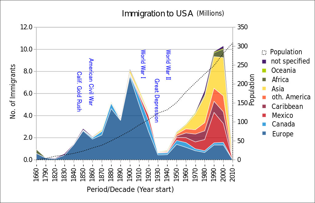
As of 2019, the population of the United States included over 50 million immigrants, more than any other country in the world, though the percentage of immigrants as a share of the total population remains lower than other countries. Approximately 15.4% of the U.S. population is foreign-born compared to over 70 percent in some countries in Western Asia like Kuwait, Qatar, and the United Arab Emirates.
The home countries of migrants to the United States has changed over time but so too have immigration laws. Prior to 1965, the United States had a quota system, establishing limits to migration by home country with a preference for European countries. The 1965 Immigration and Nationality Act ended the quota system based on nationality and instead favored family reunification and skilled immigrants. Laws and attitudes against undocumented migrants have changed as well. The Deferred Action for Childhood Arrivals (or DACA) policy was announced in 2012 to address migrants who were brought to the United States without documentation as children, and in 2014 the policy was expanded to include some parents of U.S.-born children, though the policies have faced a number of political and legal challenges.
So how might we analyze and consider undocumented or illegal migration? As with most topics in human geography, undocumented migration offers us the chance to dig deeper. Do most undocumented migrants travel across the border to the United States in the dead of night? Actually, overstaying a visa is far more common than illegally crossing the border and over half of all undocumented migrants to the United States arrive by air rather than crossing over land. Thus, while some support extensive walls along the borders and an increased spending on boarder patrols, this might not address how undocumented migration is actually occurring in the United States. Why would someone choose to overstay a visa rather than remain in this country through legal means, such as green cards or citizenship? Sometimes, it might be dangerous for a migrant to return home. Undocumented migration from Venezuela through overstaying a visa increased considerably from 2013 to 2017 as a result of political turmoil. In other cases, the wait times for a green card can be incredibly lengthy, as they are based on one’s nationality, family connections, and employment preferences. A Mexican immigrant who has a sibling who is a U.S. citizen, for example, can expect to wait over 100 years for a green card based on the current backlog. An immigrant from India with an advanced degree could face a wait time of over 50 years. And most migrants must secure a green card for at least five years before they even begin the process to apply for citizenship. It is also important to consider who benefits from undocumented migrants. While migrants themselves can secure a better life both economically and politically within the United States, businesses can also profit by hiring undocumented workers, often paying them low wages and threatening to deport workers who speak out against dangerous working conditions or unfair labor practices. Americans themselves can benefit from migrant workers by securing cheaper goods and labor for jobs that others might not want, such as field workers on farms. Thus, undocumented migration is a complex issue that will require similarly complex solutions.
Again, in stages 3 and 4 what is more common than international migration is internal migration, moving around within a country. In general, in more developed countries, rural to urban migration remains strong, initially occurring as a result of the Industrial Revolution and continuing the present-day. In the United States, there have been several shifts in internal migration over time, with people typically moving from the east to the west following westward expansion and now, increasingly, to the south. The Great Migration refers to the movement of 6 million African Americans from southern U.S. states to northern states from 1916 to 1970 as a result of discrimination and segregation in the south as well as greater job opportunities in the north (both push factors and pull factors.)
Other countries have similar patterns of large-scale internal migration. In China, for example, around one-quarter of people lived in urban areas in 1990. By the end of 2015, over half of all people in China lived in urban areas. In some cases, internal migration is actively managed by the government. Indonesia, for example, maintains a transmigration program designed to resettle families from the more populous islands, like Javi and Bali, to less populated areas. At its peak during the late 1970s and early 1980s, the program moved nearly 2.5 million people. Critics of the program viewed the resettlement as infringing on the rights and lands of indigenous peoples living in the less populated areas and as a strategy for the Indonesian government to exert greater control.
For people in more developed countries, a move might be prompted by a great job offer or a chance to live in a city with great amenities, while for others, migration might be forced by the loss of a job or by ethnic persecution. Examining human population thus provides geographers the opportunity to ask deep and critical questions about our human experience. Where we live fundamentally affects how we live, the rights we have, the job opportunities we’re afforded, how we’re viewed by our neighbors and who we interact with.
the number of people per unit area
the number of people per unit of arable land
or NIR, the percentage by which a population grows in a year
or CBR, the total number of live births in a year for every 1,000 people
or CDR, the total number of deaths in a year for every 1,000 people
or TFR, the average number of children a woman will have throughout her childbearing years (defined as ages 15-49)
or IMR, the annual number of deaths of infants under 1 year of age, compared with total live births
the average number of years a newborn infant can expect to live
the amount of time a population takes to double in size
a graphical presentation of a country’s population by age and gender groups
or DTM, a model of how a country's population structure and growth changes over time
or epidemiological transition, describes changing disease patterns and causes of death that correspond with broader societal and population changes
the number of people who are too young or too old to work compared to the number of people in their productive years
the maximum population size that can be sustained by an area based on the resources available
a permanent move to a new location
refers to migration from a location
migration to a location
reasons that push people to move from their current location
reasons to migrate to a particular location
where migrants from one area follow the path of other migrants from the same area, much like links in a chain
the presence of an opportunity between a migrant's home site and their intended destination
the involuntary movement of people from one place to another
a person who has been forced to cross national boundaries and cannot return home safely
a permanent move within the same country
movement from one region to another
migration within one region
movement from one country to another
